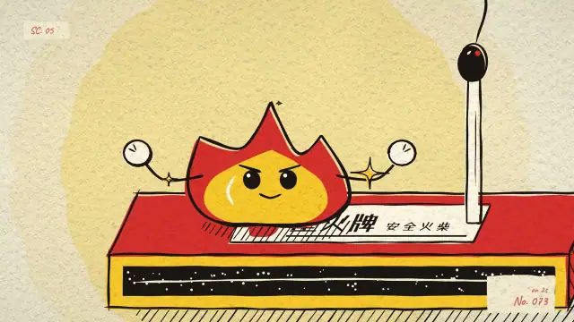
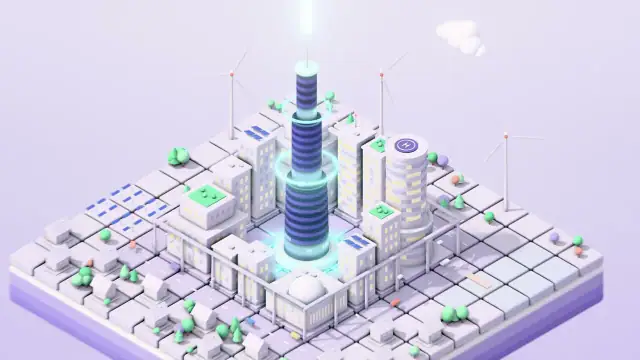
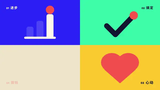
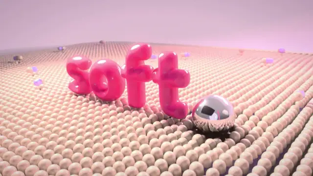
Line Art 线条动画
ATELIER LINEA — One Line·10s·MG Styles 15by Vincent Wei
A thin single-colour line is the only visual language: it draws itself on, extends, turns and morphs into the next shape, the whole film in one stroke. Minimal and premium, common in luxury, finance and architecture brand films and logo animations.
You are the director, motion designer, engineer and sound designer of ONE 10-second motion-design film.
The goal is the most classic, yet most stunning form of this style — award-shortlist / high-end commercial quality. A clean,
template-looking result is a fail. Benchmarks: Buck, ManvsMachine, Ordinary Folk, Giant Ant, Territory Studio, Apple keynote
motion, Pentagram motion identities, top Behance/Motionographer features, top 抖音/B站 designer accounts.

# Style
线条动画 Line Art / Line Animation

# Output (fixed)
- 1920×1080, 30 fps, exactly 10.000 s (300 frames), H.264 MP4 with stereo AAC audio (48 kHz), mastered to −14 LUFS
  integrated, true peak ≤ −1 dBTP. Final file: video.mp4.

# Suggested technical route
HTML: SVG paths + stroke-dashoffset (getTotalLength) + GSAP; a virtual camera that follows the pen tip
(You may choose a better route if it clearly raises quality; say why.)

# Creative seed
「一笔画」One-line narrative for a luxury / architecture brand — the whole film is ONE continuous line.
- Deep midnight ground (#0B1320 or near-black) + a single champagne-gold line (#E9D7A5), constant ~3px, round caps, a softly glowing pen tip that leads the draw.
- Story (continuous path, the tail of each figure is the start of the next): a seed → sprouts into a sapling → branches become the structural lines of a building → the building outline extends into a skyline/horizon → the horizon line lifts and loops into a monogram logo → LINE-TO-FILL moment (logo fills with gold from its anchor) → thin letter-spaced serif wordmark (e.g. "ATELIER LINEA") fades up.
- Draw speed eases into corners (cubic-bezier(0.65,0,0.35,1)); the virtual camera drifts/pushes to keep the tip in frame, then dollies out at the end to reveal the whole drawing composed as a poster; older line segments dim to ~35% as the camera moves on.
Sound: minimal felt piano + soft string swell; a pen-on-paper whisper whose loudness follows tip speed; delicate chime on the fill.

You are the director: you may change the concept, copy, story beats and brand names if you find a stronger idea, but the result must remain the CANONICAL, instantly-recognisable form of this style and must hit its signature features below.

# Signature features and key techniques (the result is judged against these)
以单色细线为唯一造型语言,线条自我描绘(draw-on)、延伸、转折并变形为下一个图形,一笔连成整支片子。极简高级感强,常见于奢侈品、金融、建筑类品牌片和 logo 动画。
视觉特征 等宽细线, 单色或双色, 大量负空间, 线条连续生长, 线面转换瞬间
关键技法 核心是 stroke 描绘:AE 用 Trim Paths 0→100%,Web 端用 SVG stroke-dasharray/dashoffset
线宽全片恒定(2~4px),转角处让描绘速度略减速,用 easeInOut cubic-bezier(0.65,0,0.35,1)
'一笔画'叙事:上一图形的尾线即下一图形的起线,路径提前在 Illustrator 里连好
线转面:描完轮廓后用同路径的 fill 从锚点扩展填充
配合微小的端点圆头(round cap)与路径抖动可增加手绘感

# How to work
1. Treatment. Write down one clear idea: a hook in the first 0.5 s (never open on more than 0.3 s of empty or black), an
   escalation, one unmistakable hero moment at ~60–75 % of the runtime, and a composed end frame held ~0.8–1.2 s with living
   micro-motion. Map every signature feature above to a moment. Keep one cue sheet (beats and hit times) that both the
   picture and the sound read from.
2. Key frames before motion. Build the look, render stills at 6–10 key times and actually look at them. Each still should be
   poster-worthy: composition, hierarchy, negative space, type set properly (kerning, line-height, weight contrast, CJK
   punctuation, ~5 % safe margins). Iterate until nothing looks default, generic, cramped or "AI-template".
3. Motion. Build the choreography and preview at low resolution. Step through the fastest moves frame by frame: spacing,
   easing, arcs, overlap, anticipation and follow-through, motion blur. No unintended dead spans; the energy follows the music.
4. Sound. Write genre-correct music and sound design locked to the cue sheet. Check that visual hits land on audio onsets.
   Master to the output spec.
5. Final. Render at full resolution (motion blur where apt), then check: exactly 10.00 s, resolution, fps, audio present and at
   the right loudness, no black frames, no fallback fonts or tofu, no clipped elements at the frame edges, no shimmer on thin
   lines, no gradient banding. Fix and repeat until you would submit it to a festival.
6. Write an honest self-critique: what is strongest, what is weakest, what you would do with more time.

# Rules
- Rendering must be deterministic: every frame is a pure function of time t. Seeded randomness only; physics and particles
  precomputed or closed-form; no real-time clocks; no state-triggered CSS transitions. A reliable route: a web page that can
  draw any time t on request, captured frame by frame with a headless browser and encoded with ffmpeg (or a Blender script
  that renders a PNG sequence).
- Assets: only CC0 / public domain / OFL / Apache / free-for-commercial-use. Record each source and licence in CREDITS.md.
  No real brand trademarks; invent brand names.
- On-screen text must be correct and natural: idiomatic Chinese, proper CJK punctuation, no typos.

# Craft checklist (what a jury looks for)
- Style authenticity: an expert names the style in one second; every signature technique is present and executed correctly.
- Motion craft: purposeful easing (no linear unless mechanical by design), overlap and stagger, anticipation and
  follow-through, arcs, squash and stretch where the style allows, consistent physics, motion blur where apt; transitions
  carried by elements, not crossfades.
- Rhythm: hits locked to the music; contrast between busy and calm; no monotony.
- Design: strong composition, grid, typographic hierarchy, controlled palette; texture and finishing (grain, glow, vignette)
  only where the style wants it; nothing looks accidental.
- Technical polish: no jitter (unless intended), no popping, no aliasing, no banding, no fallback fonts, no half-loaded images.
- Sound: genre-correct, musical, synced, mastered.

# Before you deliver, score yourself honestly
1–10 on style fidelity, concept wow, motion craft, design & typography, finish & texture, sound & sync, technical
(6 = template-level, 8 = high-end agency, 9 = award shortlist). Aim for 9; fix whatever scores lowest first.

# Deliver
video.mp4, plus a short report: the concept in two sentences; a beat sheet with timecodes; how each signature feature is
realised; the tech route; check numbers (duration, resolution, fps, loudness, true peak); your honest top-3 weaknesses.
How to use it
- Create an empty folder and open an AI assistant that can write code and run commands in it (for example Claude Code). The machine needs web rendering (Node + Chrome) and ffmpeg.
- Copy the whole prompt below and send it.
- To make it your own: change the story, brand name, copy and colours in
Creative seed, or the size inOutput(e.g. vertical 1080×1920). Do not deleteSignature features: it is what makes the style recognisable at a glance. - To push it further: once the film is done, have a second AI review it with rubric.md and paste the review back to the maker for another round. The original films went through two such rounds.